


I just bumped up the contrast some and saturated the colors and it made a huge difference I think:

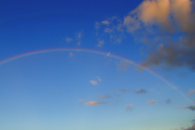
Picture 3. Just looks pretty boring (even if it does contain a rainbow.) The rainbow was fading fast as I snapped pictures and couldn't revive it completely but did make a bit of a difference.


Again with the saturation and contrast.

Picture 5. The sky isn't bad but it just doesn't "pop" like I want it to in this original photo.

Here I still didn't get the results I wanted but the saturation of colors sure adds more golds in it.

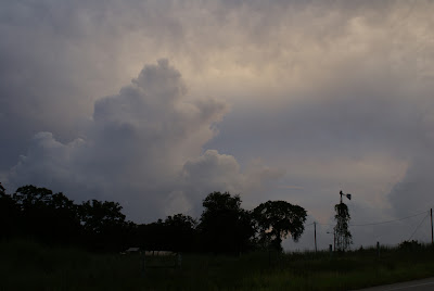
Picture 6. This is actually the only photo I did not retouch. This is how it looked straight out of the camera.

Picture 7. I wish the blues weren't so gray and that there was a little more contrast in the colors in the sky.

Saturating the colors and tweaking the contrast just a little helped some, but I still wish the blues were just a tad bluer....

No comments:
Post a Comment