Showing posts with label photoshop. Show all posts

Wednesday, May 7, 2008

Yesterdays Flowers...with a Twist

You're still going to have to look at the flowers from yesterday's post because I have nothing new to post and have spent the evening working on my painting. A project I did for my friend Denise this week gave me an idea. I reposted yesterday's photos, but made each one appear to be painted. If only the real painting I'm working on could be completed so quickly and effortlessly!!!


Thursday, January 10, 2008

Dawt Mill Revisited...With Photoshop

I decided tonight to tweak a few of the pictures I took on Christmas vacation. I opened 3 pictures all taken the same day and all taken at Dawt Mill in Missouri.


This first shot was taken of the dam behind the mill. This shot is straight out of the camera, nothing done to it. The water did really appear this blue that day.


I saturated the color a bit to try to enhance the evergreens and sky and added a soft border, and I tweaked the contrast just a hair.


I then changed the picture to sepia tones. I like this particular picture better in full color.


This shot was taken standing on the bridge downstream from the waterfall. It seems pretty bland with all the bare branches and the gray sky. But, I want to try to bring out the reflections in the water a little more. This is straight out of the camera:


Here's the same shot with the color saturated and a soft border added. I also selected a few areas of the photo to saturate separately. Notice the reflections now.


I then zoomed in to crop the photo closer to the reflections, making sure to keep the blue waters downstream still in the picture.


Here's the water wheel, straight out of the camera.


The first thing I did was remove the unsightly extension chord from the photo altogether! (The clone or rubber stamp tool is awesome!) I then saturated the colors a little but not much. I tried to get the sky bluer but didn't have much luck. Then I added a soft border.


Then I changed it to sepia. There's just something about old wooden objects in sepia.

Monday, November 5, 2007

More Photoshop Effects

I dug out the very first portraits I ever took of Heather after I bought my first good 35mm camera. When Heather was in 3rd grade my friend Suzanne had some professional portraits made of her daughter, who danced with Heather at that time. The pictures were beautiful, but we couldn't afford to have portraits like that made of Heather so I decided to see what I could do myself. I tossed a black sleeping blag over the living room window, took the shades off some lamps and positioned them around her and snapped away. These are some of those results, along with some new versions I've just created in photoshop.


The original photo:


After Photoshop:


I have several photos I've taken of Heather in the mirror and this one is my favorite. It was taken as she was preparing for a dance clinic in Houston, TX in 5th grade.


Here is the same shot again, after I've played with it in Photoshop.
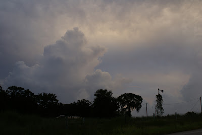
Monday, August 27, 2007

Compare the Photoshop photos to the originals


Only one photo WASN'T modified in photoshop. Check them out:


Picture 1--This one is the original. Check out the photoshopped version under it.


Not a huge difference, but some sublte color changes.


Picture 2. This original just looks a little dull and has little contrast in the sky.


I just bumped up the contrast some and saturated the colors and it made a huge difference I think:

Picture 3. Just looks pretty boring (even if it does contain a rainbow.) The rainbow was fading fast as I snapped pictures and couldn't revive it completely but did make a bit of a difference.

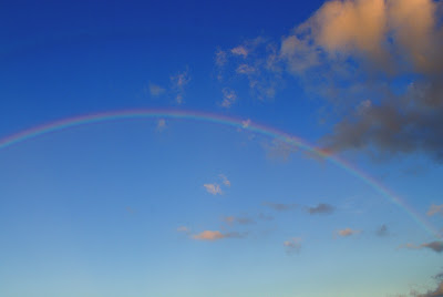


I really bumped up the contrast and saturation in this one, to the point the blues look almost unreal. But, it sure added color to a gray sky.


Picture 4. Again, pretty gray and drab for a rainbow in the original shot...

Again with the saturation and contrast.

Picture 5. The sky isn't bad but it just doesn't "pop" like I want it to in this original photo.

Here I still didn't get the results I wanted but the saturation of colors sure adds more golds in it.

Picture 6. This is actually the only photo I did not retouch. This is how it looked straight out of the camera.

Picture 7. I wish the blues weren't so gray and that there was a little more contrast in the colors in the sky.


Saturating the colors and tweaking the contrast just a little helped some, but I still wish the blues were just a tad bluer....

Saturday, August 18, 2007

The Wonder of Photoshop

I was very disappointed with all the power lines in most of the sunset photos I posted last time. As much as I love electricity and all that it brings to my home, I sure don't like all the lines messing up the views everywhere. So, I played in Photoshop to see what I could do about some of those photos. I don't spend a lot of time playing in Photoshop anymore, because well, when I get started it begins to really consume my time and nothing gets done. So I limited it to 3 pictures:


I like this orginal picture well enough, but to me those power lines are very distracting from the image I was trying to capture:


Voila! No power lines, and a wee bit more saturation and contrast:


Here I was trying to get under the power lines and still get a shot of the partial moon that was beginning to show through the clouds. I still got some power lines and the moon just didn't shine at all.


So, I removed the power lines and played with the contrast to try to get the moon to pop more and I bumped up the saturation some too.


I just love those clouds off in the distance, except the power lines are right in the way of the prettiest spot in the picture!


No more power lines!!!


And now let's zoom in on those clouds:

Pages

Pages - Menu